

Welcome UI/UX designers to the world of AI, this is where you can enhance your productivity, get to other levels of your creativity, and at the same time you can make some room to rest up, as AI helps you save some time!
You must be wondering, how can expoze.io reap the most benefits for you. This article will give you an in-depth understanding of what you can accomplish with expoze.io
As a UX designer, you are responsible for creating a user-friendly and enjoyable experience when people interact with digital products. For that, you conduct user research, design the layout and flow of the product, and conduct usability tests to ensure it meets users' needs and expectations.
expoze.io can be your assistant, as it has been built based on the user’s ‘attention’ and eye-tracking research. When you upload a screenshot of your website prototype on expoze.io, it will give you an understanding of:
- Your audiences’ attention pattern (where does their sight go first and what content keeps them engaged for long).
- How you can build your information architecture, as it will give you an intuitive and user-friendly interface suggestion through heatmaps.
- How well it will perform in usability testing, as expoze.io uses the data of humans’ eye-tracking patterns, this gives an understanding of how people will interact with the website.
- User journey mapping, as you can track where people are looking and if the important elements are getting any attentive views.
Now, as a UI designer, you focus on the visual and interactive elements of a digital product, such as its appearance, layout, and user interface components. You ensure that the product is visually appealing, consistent, and easy to use.
expoze.io can be your guiding stick as it can help you decide:
- What visual design would gain the most attention through A/B testing.
- If the aesthetics you choose will give responsiveness from both desktop and mobile users. All you need to do is take screenshots of the website from different screen sizes and upload them on expoze.io to test if they all get similar attention results or if the aesthetics work best for desktop but not mobile, etc.
- Where to display the important icons like CTA, so it does not go unnoticed by users.
Overall, you can get creative with expoze.io and generate answers to most of your questions, all in one place! Pretesting is the way to go as you can avoid major hassles in UI/UX designs before the website goes live and it helps to convince colleagues and stakeholders of the efficacy of your design! This saves you time, efforts and you look authentic and experienced in front of your users.
Now that you know what you can get out of expoze.io, let’s guide you on how to use this amazing AI tool, so you can start working on it right away!
Step-by-Step Guide to Using expoze.io on a Desktop
Here you will learn how to:
- Use different heatmap options on expoze.io
- Test what your user/visitor sees
- How to use the video option to analyze your design
- A/B testing
- How to use different heatmap options on expoze.io
This section will tell you how the different heatmap options available on expoze.io work. You can use this as a guide before selecting options, so you don’t waste your credits away and make your experience hassle-free!
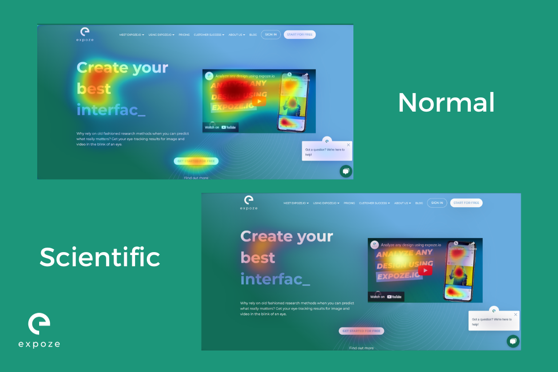
In the image above, our “Normal” heatmap provides a visual display that's probably as familiar as your morning coffee, using the classic jet colormap. It's like having attention-grabbing fireworks right on your screen! This heatmap is the easiest to interpret and is user-friendly. This is the basic heatmap, so if you want something in general to show the attention spread, this is a great choice!
Our “Scientific” heatmap on the other hand isn't just a lab coat-wearing overachiever; it's the real deal. It's scientifically sound because it boasts a linear color distribution. In plain language, if one spot on the attention heatmap shines twice as bright as another, it's predicted to get twice the attention. It's like having a mathematically precise spotlight on your data! Moving from general to specific, this heatmap gives you a more precise prediction of the attention spread. So if from the “normal” heatmap you are not able to make out between two elements which one is getting more attention, this option should help you solve that problem.
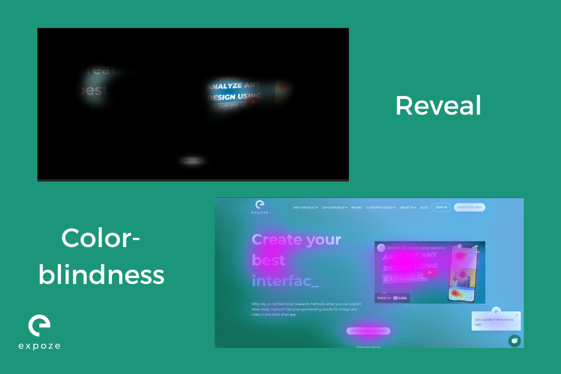
With our "Reveal" heatmap, it puts the spotlight on what truly matters. It makes everything else disappear into the background while shining a light on the areas where attention prediction is at its peak. In short, everything that you cannot see through the filter means that these elements do not get any attention. This heatmap is great for cross-checking if your main buttons and elements are even visible in your user’s peak attention period. If the user cannot see these main elements easily and has to look for them specifically, this “reveal” heatmap can help you solve this problem by making you aware of where exactly their attention is on the page.
Our “Colour-blindness” heatmap gives a colorful solution. We use shades that even the pickiest of eyes can easily tell apart. Say goodbye to the confusion and hello to crystal-clear distinctions! So if you are dealing with color blindness, expoze.io has got your back! You will find color options that best suit your concerns.
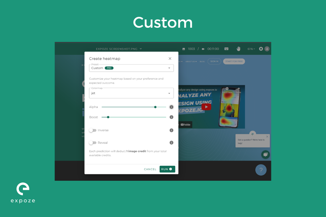
Our “Custom” heatmap lets you craft your own unique heatmap tailored to your desires and anticipated results. Your heatmap, your rules! Here you can choose the color or shade you would want your heatmap to be displayed in, through the “colormap” option.
The “alpha” value holds the key to your output's transparency. Crank it up, and your saliency prediction becomes as solid as a rock. Turn it down, and it transforms into a sheer wisp of transparency. When it comes to images, you have the power to tweak the prediction's transparency on the fly. Just remember, your download will faithfully reflect the transparency settings you choose here.
The “boost” option can help you elevate your saliency predictions. Values over 1.0 enhance low-saliency areas, making them more prominent and less transparent. Values between 0.0 and 1.0 tone down high-saliency spots. Finding the sweet spot is key!
The “inverse” option flips the colors of your chosen heatmap without changing their transparency.
This heatmap option is mainly designed for how you would like your heatmap to look. This lets you craft your personalized heatmap preferences so you have more control over how you want your attention predictions to be presented.
- Test what your user/visitor sees
One frequent mistake we encounter is when users don't employ real-world conditions for their materials, which is particularly evident during UI/UX testing.
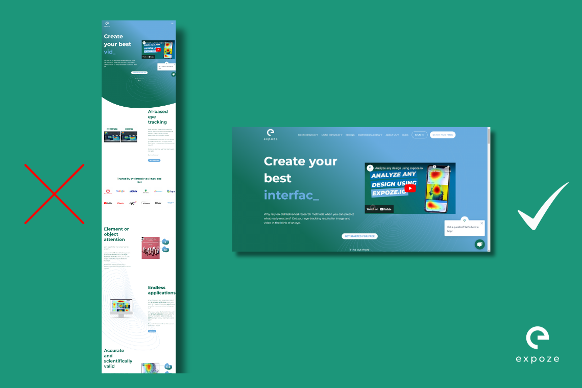
Let's say you want to test your website, which is fantastic. However, it's crucial to remember that a website visitor only experiences what's visible on the screen. Taking a screenshot of the entire page won't cut it because people don't view your webpage that way. Opt for capturing multiple screenshots of what's in the viewport instead!
- How to use the video option to analyze your design
Interested in dissecting your customer's path as they navigate your website or app? You've got the power!
Hit that record button, and let your screen do the talking as you scroll and click away. With expoze.io, you'll uncover the hotspots and elements that capture people's attention. It's like a backstage pass to the user experience show!
- A/B testing
Imagine you have formed two versions of your content and now you want to test which works best for attention.
You can upload the screenshots of the two versions on expoze.io and select the area of interests (AOIs) where you want most attention to go. The results of the heatmap and the AOIs should help you choose the most attention grabbing content.
Let’s take Amazon.nl and bol.com as an example.
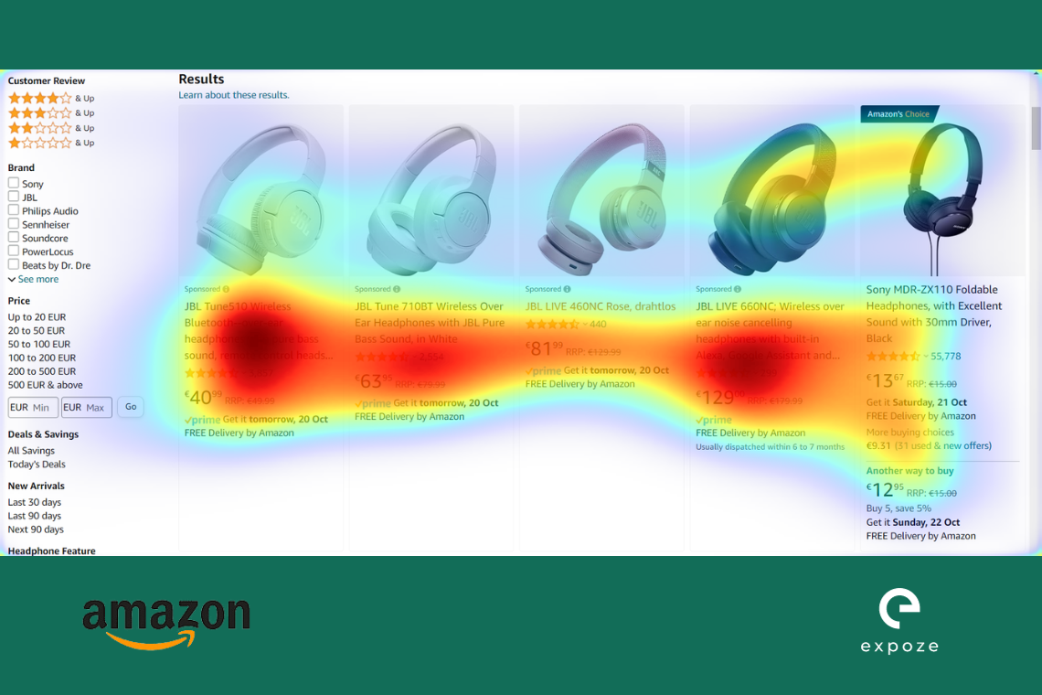

As can be seen from Amazon’s heatmap, if somebody looks up a product (headphones in this case), the results grab the user’s attention the most on pricing and not the product picture.
For bol.com, the attention is displaced both at the product and the pricing. The attention is also not spread out amongst the products like it is for Amazon.
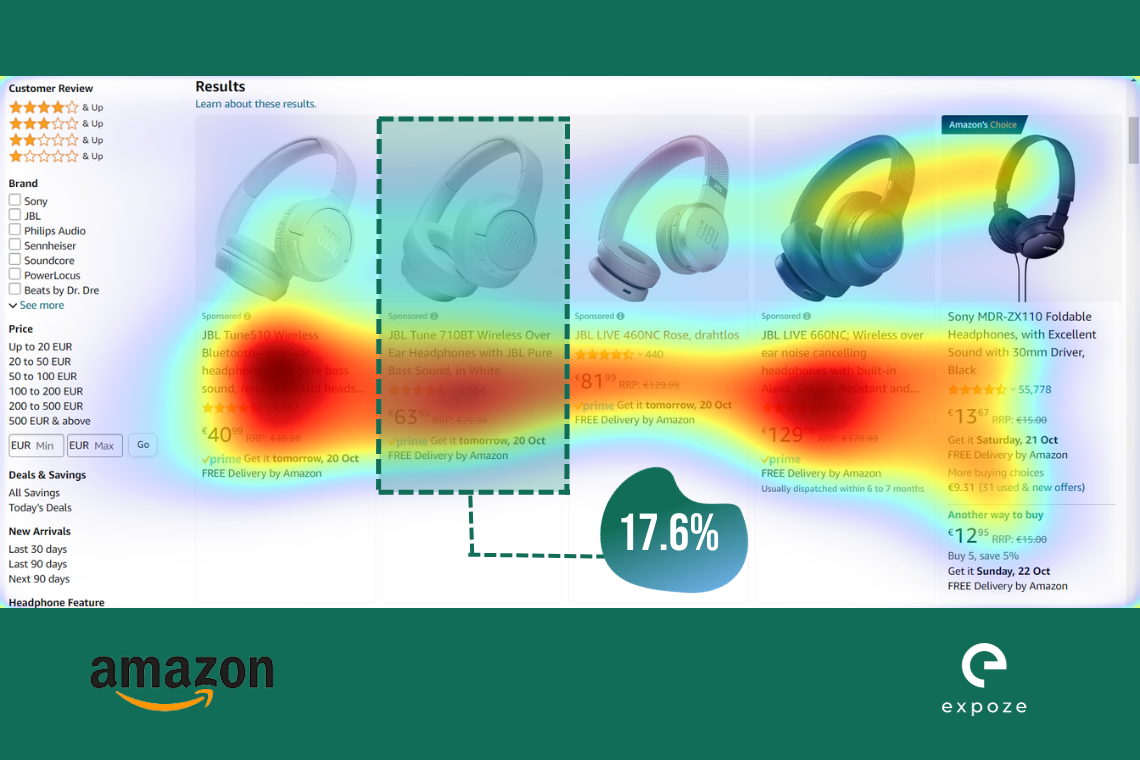

If you take area of interests (AOIs) into consideration, then you can see from the example images above that Amazon’s products are getting divided attention compared to bol.com. The second headphones option listed on Amazon is getting just 17.6% attention compared to the second headphones option listed on bol.com, which is getting a whooping 35.2% attention.
As a UX/UI designer, whatever your preference is for the website, you can test for that goal accordingly via A/B testing which can help you choose the best option in minutes.
UI/UX design for mobile application
You must now be wondering, how would you test mobile apps on expoze.io? The answer is simple! Screenshots.
Take screenshots of your app and upload it on expoze.io. The rest is the same process as it has been explained above. expoze.io takes the screen size into consideration and gives the attention prediction accordingly. To give an example, let’s take Booking.com and Hostel World’s app design.
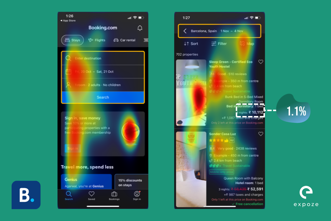
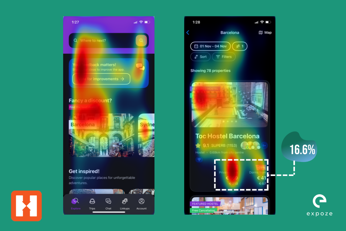
As you can see from the images above, the heamap is showing all the places where a user would pay attention. The images on the right side show AOIs calculated for the pricing feature on the app for both the brands. Booking.com gets only 1.1% attention on the pricing of the room it displays compared to Hostel World which gets 16.6% attention.
Depending on what your brand focuses on, you can see if your most important element is getting enough attention. You can also compare your apps with other apps like this!
Plugin Options
We understand the hassle of constantly switching between apps and solutions. That's why we have introduced 3 plugins.
You can predict attention on your designs effortlessly through these plugins!
Conclusion
Use this guide to help you predict faster and better! If you have any questions, you can check the frequently asked questions list or contact us here.
.png)
.webp)


